
The problem
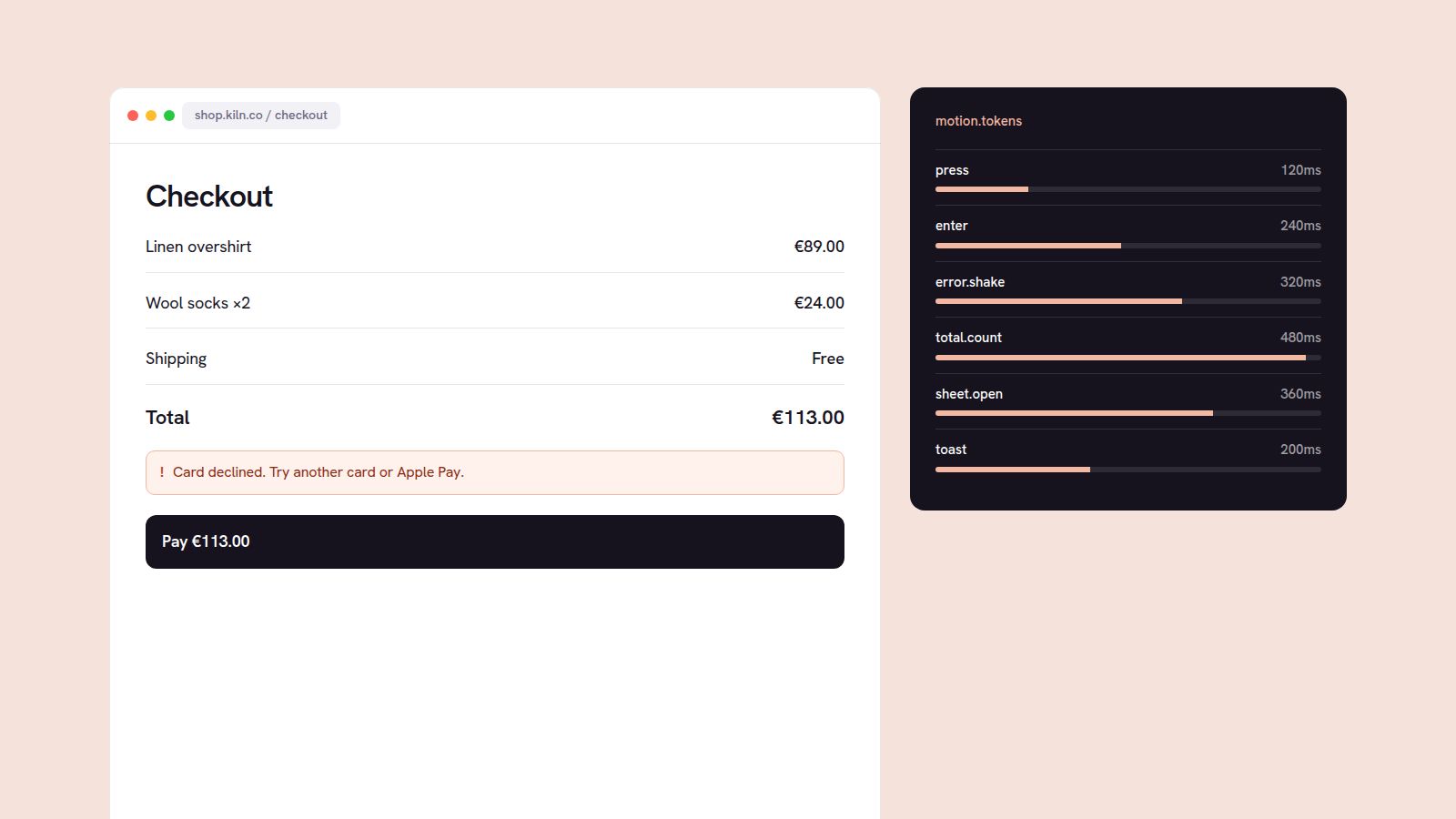
Checkout felt abrupt. Errors appeared without warning, totals jumped around, and web and app animated the same moments differently.
Constraints
Checkout is the riskiest page in the business, so every change shipped behind an A/B test, and motion couldn’t slow anything down.
Design decisions
Motion should explain cause and effect, never decorate. I mapped every state change and gave each one a single, consistent behaviour.
What I built
Twelve duration and easing tokens shared by web and app, plus React primitives that use them by default, documented in Storybook.
Trade-offs
We dropped a playful success animation the team loved because it added 400ms to the confirmation. Fast beat fun.
The result
Checkout conversion rose 6.2% in an A/B test, and the motion tokens now drive animation across the whole product.
What I’d do differently
I’d test reduced-motion users as a separate cohort from the start instead of adding that check at the end.